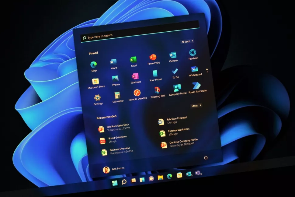
Windows 11 was released on October 5, and while it is a better version of Windows 10, many people are still using the old version because they are not sure if it is stable. It’s been a year since its release, and Microsoft has been working hard on polishing and fixing the bugs and performance of Windows 11.
Is it worth it to update from Windows 10 to 11? Yes, it is worth it since Windows 11 comes with a wide range of features, either previous updates to Windows 10 or new features introduced in Windows 11. That being said, we can now look at the noticeable improvements, performance, and design changes in the Windows 11 update.
App folders in the Start menu
Microsoft introduced a brand-new design for the start menu which has been built from the ground up. With Windows 11 version 22H2, now the user can be able to customize the pinned apps area, create app folders, and resize the pinned apps to show one more or one fewer row.
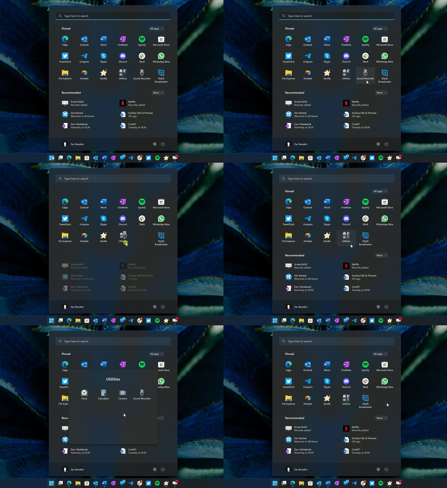
When you want to create an app folder all you have to do is drag one app icon over the other, wait a bit then let go to create the folder. If you want to rename a folder, first reorganize apps within a folder, and then move the folder around in the pinned area of the start menu. This freedom to create and personally reorganize your apps and folders gives users a great experience since it helps the Start menu feel less cluttered.
File Explorer
There are a ton of improvements to File Explorer with Windows 11 version 22H2, First, the new “Home” page which is now the default page when you open the file explorer app Previous users of Windows 10 can notice a slight change in layout with a new “favorites” and “recent” area below the usual quick access folders.
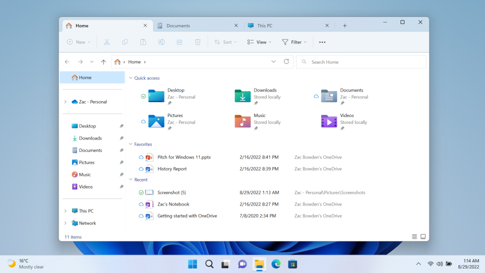
Microsoft has also moved user folders from the “THIS PC” page, which now only shows storage devices. This takes time to get accustomed to but after using it a little bit you get the hang of it. now if you want to access your user folders, you are required to use the new Home page or the sidebar. Finally, Microsoft is also adding tabs to the file explorer app. Many people have been asking for this feature, which just works as expected, just like in browsers e.g. Chrome, and Firefox, the tabs are found along the top of the app where you can open new tabs, and switch between them.
Touch Improvements
With the 2022 update, Microsoft further improves the touch experience for touch users with the introduction of gestures. The previous version had a “tablet mode” interface which was only for tablet users. With this new update, Microsoft has changed the interface for desktop touch users as well. The new gestures available with version 22H2 are:
- Swipe up from the bottom middle of the screen to access Start.
- Swipe right in the Start menu to access the All Apps list.
- Swipe up from the bottom right of the screen to access Control Center.
- Three-finger swipe left or right in the middle of the screen to switch between open apps.
- Three-finger swipes up in the middle of the screen to access Task View.
- Three-finger swipes down in the middle of the screen to minimize all running apps.
Apps
Microsoft has updated and added several in-box app experiences with the 2022 update for Windows 11, Let’s start with Task manager. The new design is similar to other Windows 11 updates. This is quite an improvement for Microsoft since the last time we saw an update in the UI of the task manager was over ten years ago with Windows 8. This new interface has a sidebar on the left side which contains all the different tabs that the task manager has e.g. startup, user, details, service, and performance tabs. The hamburger menu can be used to access them.
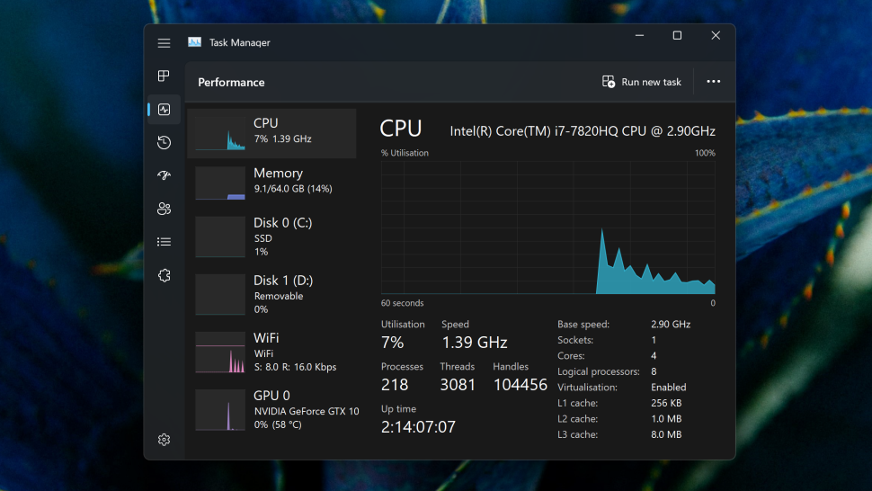
We can also notice relocations of actions such as “end task” and “run new task” which have been moved to the top right corner. Just below the windows controls, the graphs have also been made to match your system accent color. Microsoft is building new apps called Clipchamp and family safety with this new update. to know about climpchamp and family safety read full article here
Accessibility
Microsoft has been known for its continued advancements in its accessible design over many years. The trend still continues with Windows 11 version 22H2. With this update, a new feature “voice access” enables a user to control their pc with just their voice. And yeah I know you are saying that previous versions of windows had this feature, but I beg to differ because this one is more advanced. When you enable this feature, a narration bar will appear at the top which will enable you to toggle between on and off commands such as “open start menu” or “scroll edge” which work perfectly fine. you can also try cool tricks like moving the cursor to a specific place on the screen or even typing sentences into text boxes and the list goes on.
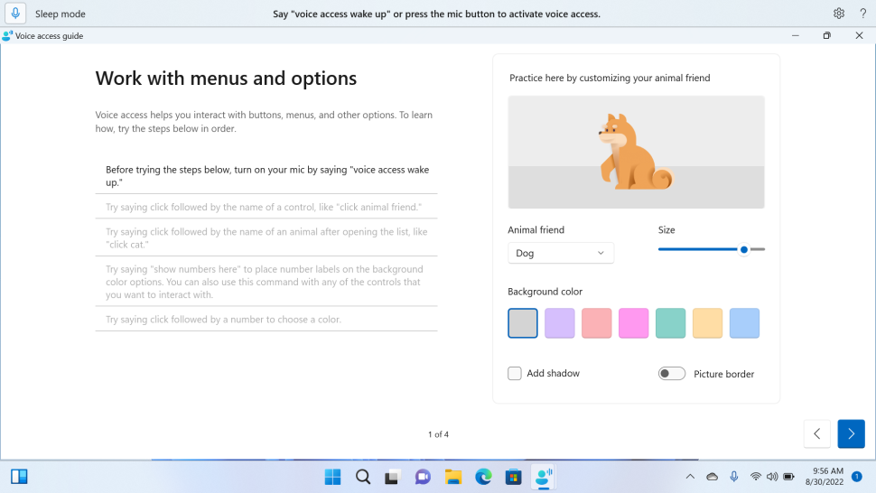
this update comes with a live caption feature that enables captioning of any content which is by the way supported across all devices i.e. iOS and Android. The best part is that this feature does not need an internet connection to work.
Taskbar and Action Menu
Microsoft has finally addressed the Taskbar functionality which was not available in other versions of Windows 11. But with this update users can now drag and drop files between apps using the taskbar. This allows multitasking and restores the functionality which was found in other versions of windows, but the UX is quite the same as we saw in version 21H2. I like this simple touch more than the complex taskbars we had in previous versions.
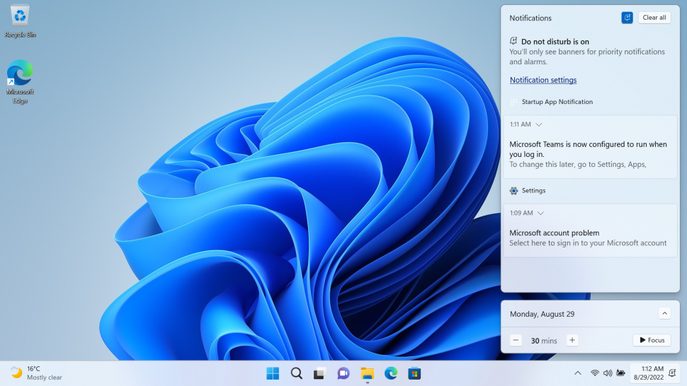
We can’t ignore the obvious notable changes that the action center has received. Let’s start with “focus assist” which used to be located in the quick setting and has now been renamed “do not disturb” and moved to the notification panel. Microsoft knows the value of time and the role that time plays, so they added a new “focus” timer under the calendar flyout which actually makes sense users can even sync the focus timer with their to-do list or even Spotify.
Bluetooth’s action
Finally, Microsoft has improved the Bluetooth action which is found in the quick setting panel. In the previous version, it was not possible to view or control Bluetooth devices in the action menu. And if you tried to click the Bluetooth tooth device you would be given the option to edit it in the settings window which was quite frustrating for me.
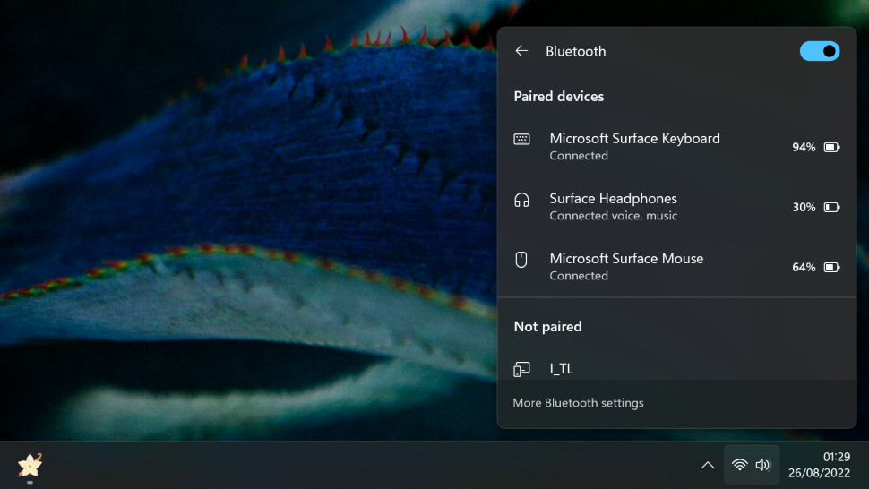
But this has been made quite simple since all the actions can be done work can be done on the action menu which makes this behavior in line with the other quick setting actions.
This video covers all we have talked about in-depth. Make sure you watch it.
